ride North End
Indoor Cycling Studio Logo Design

Communicating the Space

ride logo lockup

ride North End is an indoor cycling studio, with a special twist. More than just exercise and juice, ride offers a space unlike any other. Riders are enveloped by a dark sultry atmosphere as they pedal away their stress. In addition to communicating the uniqueness of that space, owner Melina also desired a logo that did not feature the common wheel imagery found in her competitors' logos.

Elemental Romance
Beyond the Obvious

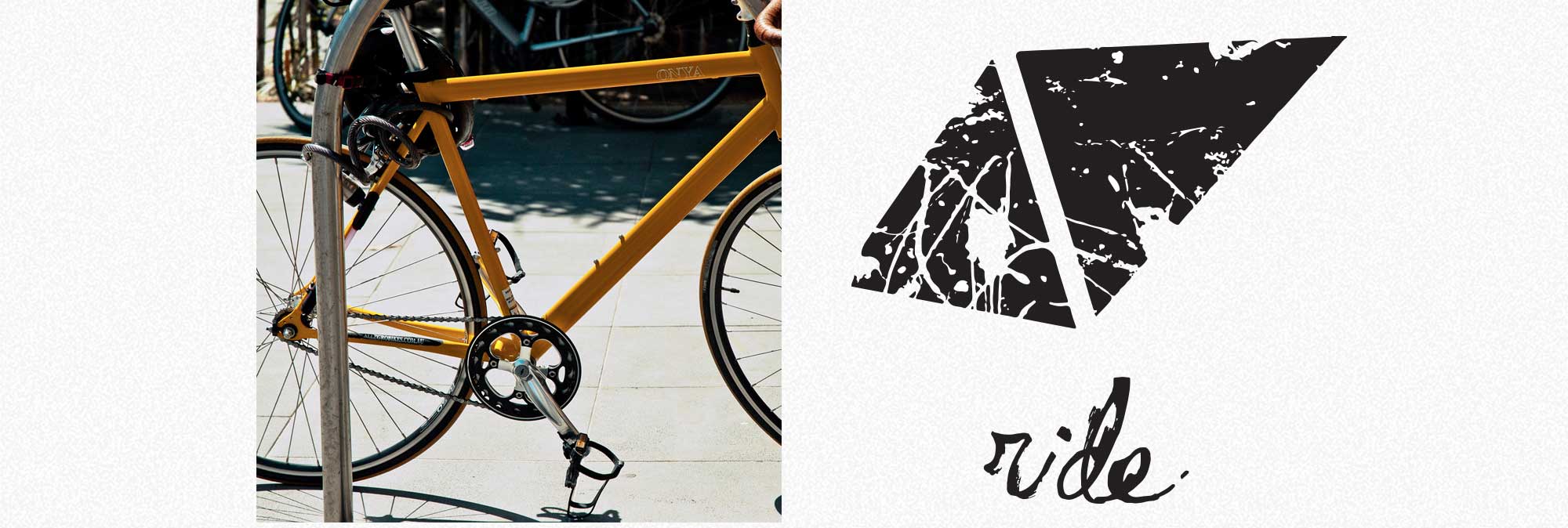
ride bike logo comparison

We constructed the logo based on a stylized rendering of the frame of a bicycle. Then we applied texture to capture the atmosphere of the brand. Scalable logo with non-wheel imagery and romantic qualities? Done.

The Unexpected Inevitable

Getting It Right

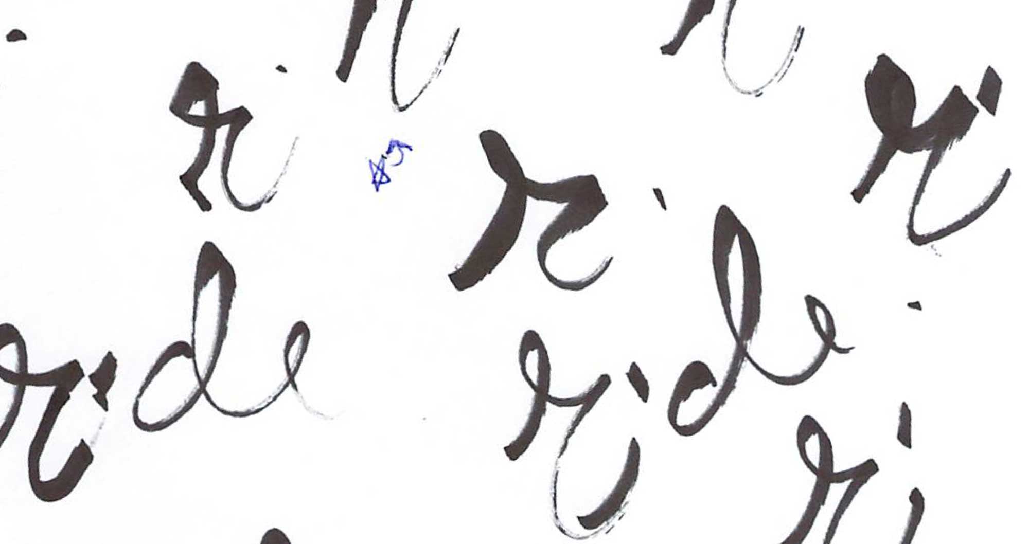
ride logo sketches

To communicate the sultry ethereal ride vibe we needed hand-rendered typography without question. This led to quite a lot of experimentation and long hours spent with a sharpie. Our designer may have lost a few brain cells, but eventually we arrived at an iteration that's the perfect mix of romantic, gritty and lovely.

Just...One More

Let's Communicate Your Space

We can craft a logo that does just that Contact Us Now