Communicating Empowerment
Body by Monika is personal training for women that offers empowerment and community through holistic, intense personal training.
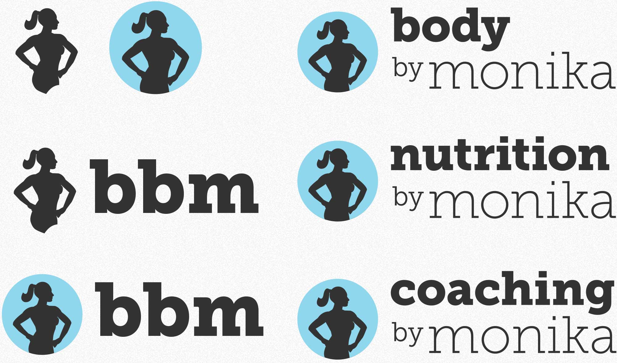
A core belief of BBM is that a muscular, toned body can be beautiful and feminine.
patientMoon delivered a logo that showcased that female empowerment and beauty, using the client herself as a model for the iconography.
Inspiration from Within
Exploring the Brand Elements
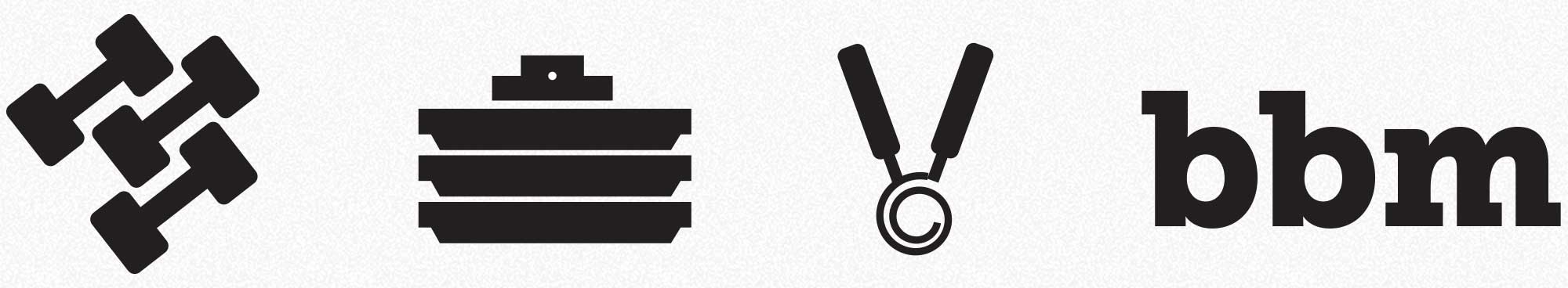
Initially, our focus was the community aspects of Body by Monika, represented by fitness and nutrition accoutrements.
Finding the Right Symbol
Bringing the Body into Focus
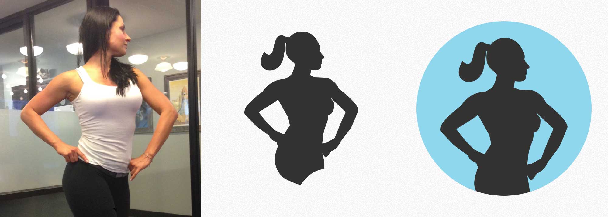
To achieve this end, we had the client herself pose in a standard body builder pose (many of her clients go on to excel in figure and competitions) and drafted a silhouette inspired by this pose. This strong, self assured posture is balanced and complemented by a graceful flourish of hair and a circle encapsulating the figure.
More Woman, Less Abstract
Every Detail Matters
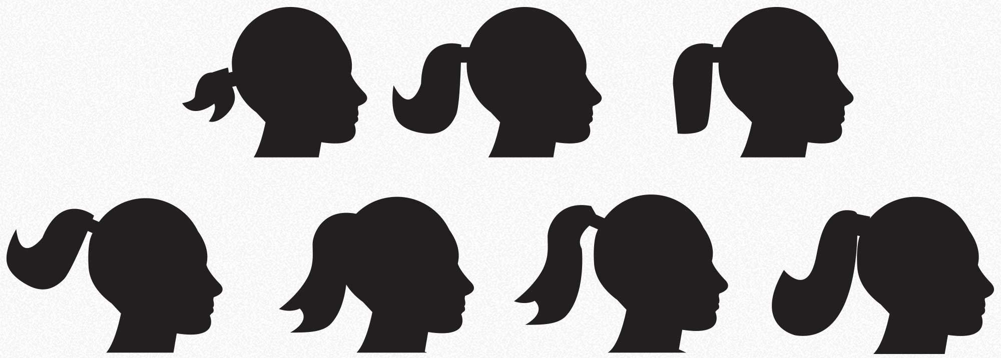
We’re all about detail! To an exceptionally committed degree. These are some of the many ponytails we drew over the course of this project. Illustrating hair that communicates both grace and strength isn't easy, but we're up to the challenge. Each ponytail – like a snowflake or a rorschach – has it’s own personality, no?
The Fun Never Stops
Typography
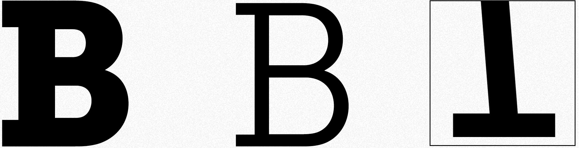
Type is an important part of logo design as well. The rounded forms of Museo Slab emulate the grace that Monika strives to produce, while the harder-edged slabs impart a feeling of power, structure and strength. The perfect analogy for BBM.
No Serif Untouched