Rebirth
Body Transformation Center

Logo Design for a Personal Training, Fitness Coaching & Nutrition Studio

Fusing the Pieces Together to Bring Your Ideas into Reality

Logo Design for Rebirth Body Transformation Center in Wakefield, MA

Julian, Rebirth founder, came to us with a clear idea for his logo – he knew he wanted a phoenix rising in a circle. We used refined details to synthesize the toughness, compassion, empathy and patience of the Rebirth System into a logo that fully embodies Julian's vision and the Rebirth message.

From Spark to Flame
Increasing Empathy

rebirth body transformation center logo comparison

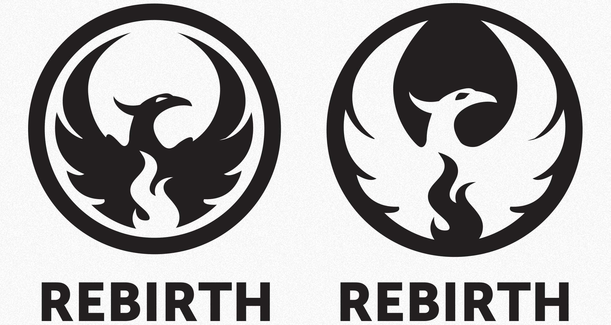
The Rebirth System is a powerful, holistic approach designed to succeed where others have failed. To demonstrate that resolve, we made a tough bird. However, toughness isn't the only aspect of the brand. There's also compassion, empathy and patience. To capture this multi-dimensional brand, we need our bird to have some depth.

We iterated on the design, softening the sharper points of the wings and the eyes. We also converted the logo to a "knock-out," creating a softer closed shaped for the overall form.

Challenging but Supportive

Every Detail Matters

rebirth body transformation center logo comparison

We burned through several versions of the flame in the center of the logo. From the many sparks, one flame burned brightest.

Disco Inferno

Typography

rebirth body transformation center typography

To ensure consistency, we utilized the same typography for the logo and website. Museo Sans is a clean orderly sans typeface, with a subtle softness. The perfect fit for Rebirth – a marriage of clarity and strength.

The Right Voice

Ready for a Logo that Soars?

Let's get the creative sparks flying. Contact Us Now